Image Programs Shootout Part 1
19th January 2005 · Last updated: 5th October 2016
In this first part, I'll be comparing the first release of Adobe's Photoshop Elements with the latest version released late 2004. In the second part, I'll be looking at Jasc's Paint Shop Pro, comparing version 7 with 9 (the latest release). I won't be giving a full review of each program, as they contain a lot of features - to go through them all would take many pages. Instead, I'll be listing the main issues I've found, along with screenshots to highlight any major differences. For all is not rosy in the land of image editing programs...
Sections/Permalinks
Introduction
I adore version 1 of Photoshop Elements ("PSE1") - I cannot work without it. I was a die-hard user of Paint Shop Pro 7 ("PSP7") until PSE1 came out. PSE1 was a tenth of the price of Adobe Photoshop ("PS"), yet had most of the features! All the filters were included, even a File Browser, which PS at the time did not have. I find the quality of output in PSE1 to be first-class. Outputting images using 'Save for Web' seems to compress them beautifully, giving much smaller files than those saved from PSP7 using the same settings. Some of the filters in PSP7 seem hopelessly amateur, while those in PSE1 blow me away. I find the bevel and shadow effects enable you to get professional-looking text in no time. Everything about the program seems just right.
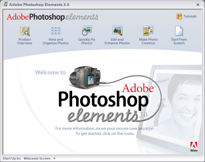
Version 2 ("PSE2") was released, but I never bothered to get it. It appeared to be more or less the same. So when version 3 ("PSE3") came out, I thought now was the time to upgrade. I'd be sure of enough new features to warrant the price, I thought. So when it arrived, I was ecstatic thinking of all the great new features and improvements they had surely made.
There's a new image browser, which appears to be taken from Photoshop Album 2. You can view images by day, month or year. Add tags to an image to search for it later. (But only JPG, TIFF and PSD files!) You can also use images to create emails, calendars, cards and more.
A new Quick Fix button gives you the commands the program feels you will need most, hiding the rest.
The new manual is one the best I've seen. Lightweight, but with full-colour screenshots throughout.
Installation
So I excitedly installed it off CD. Oh dear. What had gone wrong? This was not the fluid program I was used to. Toolbars moved around as they kept being redrawn, images flashed and moved around the screen after opening them. I will detail all these annoyances soon, but one thing had me angry as hell.
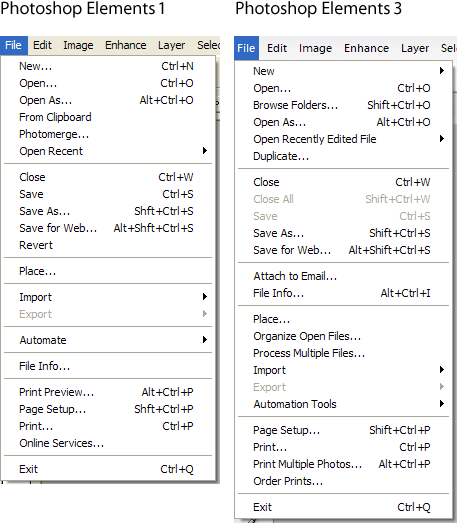
There are no Copy and Paste icons on the main toolbar!!! This is the work of fools, madmen seeking to destroy a usable interface, rubbishing all that had gone before them. And for what? To make the program more appealing to beginners? Quite simply, the Copy and Paste icons - along with others removed, such as Save for Web - were the icons I used the most in PSE1. I am always copying and pasting images and bits of layers - I need to be able to go straight to the icons. But in PSE3 I am slowed down because now I have to use the menus, then click on the options to copy or paste from there. Or learn to use keyboard shortcuts I find intrusive to workflow. (I note with horror that PSE2 appears from screenshots to be missing these icons too, though it has Save for Web and many others that have been removed. While PS looks to have no icon toolbar at all!)
Why have they removed these icons? I once read how Adobe were proud of the interface in PS, which had, they claimed, not been radically changed for years, despite all the new features added with time. Yet with PSE3, they appear to have thrown away the interface of PSE1 completely and redesigned it with big colourful icons, including two rounded ones, which are so ridiculously wide that they run the risk of being cut off on smaller screens. Indeed, a screenshot in the manual appears to confirm this.
OK, so perhaps I can just customise the toolbar and restore the missing icons, I thought. Nope. No can do. There appears to be no way to customise the toolbars at all! These toolbars are fixed! My temperature was rising.
Compare this to PSP7, where toolbars can be set up exactly as you wish. I always add a couple of icons I use a lot when installing this program. Compare PSE3 to any other major program you might use a lot, such as Word. See the Copy and Paste icons? Hide them if you must, but please don't remove them altogether!
Problems
In a review of PSE3 in PCAnswers magazine issue 140 Christmas 2004, they gave the program 95% in a Group Test. They wrote:
"Standard edit mode has all the familiar toolbars and palettes from previous versions."
Sadly, this is not true. Oh, it looks great - all shiny new buttons - but someone at Adobe needs to have a good check on the interface (and their head). For now I present a list of other problems, bugs and scandalous behaviour I have found in this program. I'm sure the list is far from complete, but will suffice for now.
- The program replaces Windows XP's built-in right-click Preview!!! Now, when you try to preview an image from anywhere in Windows, PSE3 boots up (which takes a while). If I want the instant Windows preview back, I have to right-click and choose 'Open with' then select 'Windows Picture and Fax Viewer'. No program has a right to interfere with parts of Windows it has nothing to do with. It can lead to clashes between other programs that might also alter the same things. Don't do it!
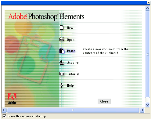
- There's no option to paste from the clipboard via the splash screen when the program starts. (There was in PSE1, which I found quite handy.) Again I am forced to take the long route and use the menus.
- On the Save for Web screen, the Zoom drop-down menu has been moved to the bottom-left corner. This is bad because most of the other buttons are on the right, which is where the Zoom menu was in PSE1. On a large screen, that means moving the mouse all the way across the screen, then back again each time you adjust the zoom. There is a new Magnifier icon though, which is placed in the top-right corner.
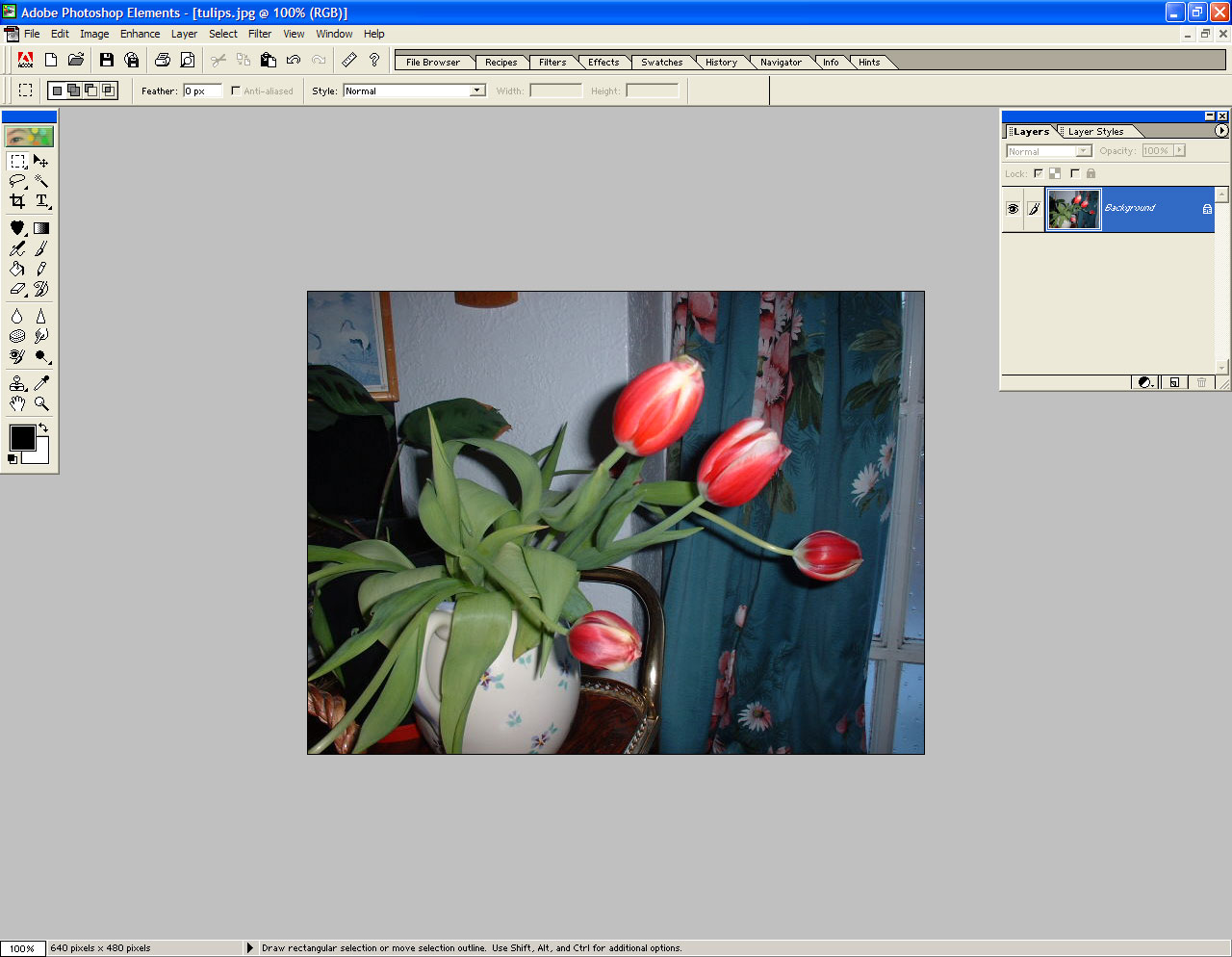
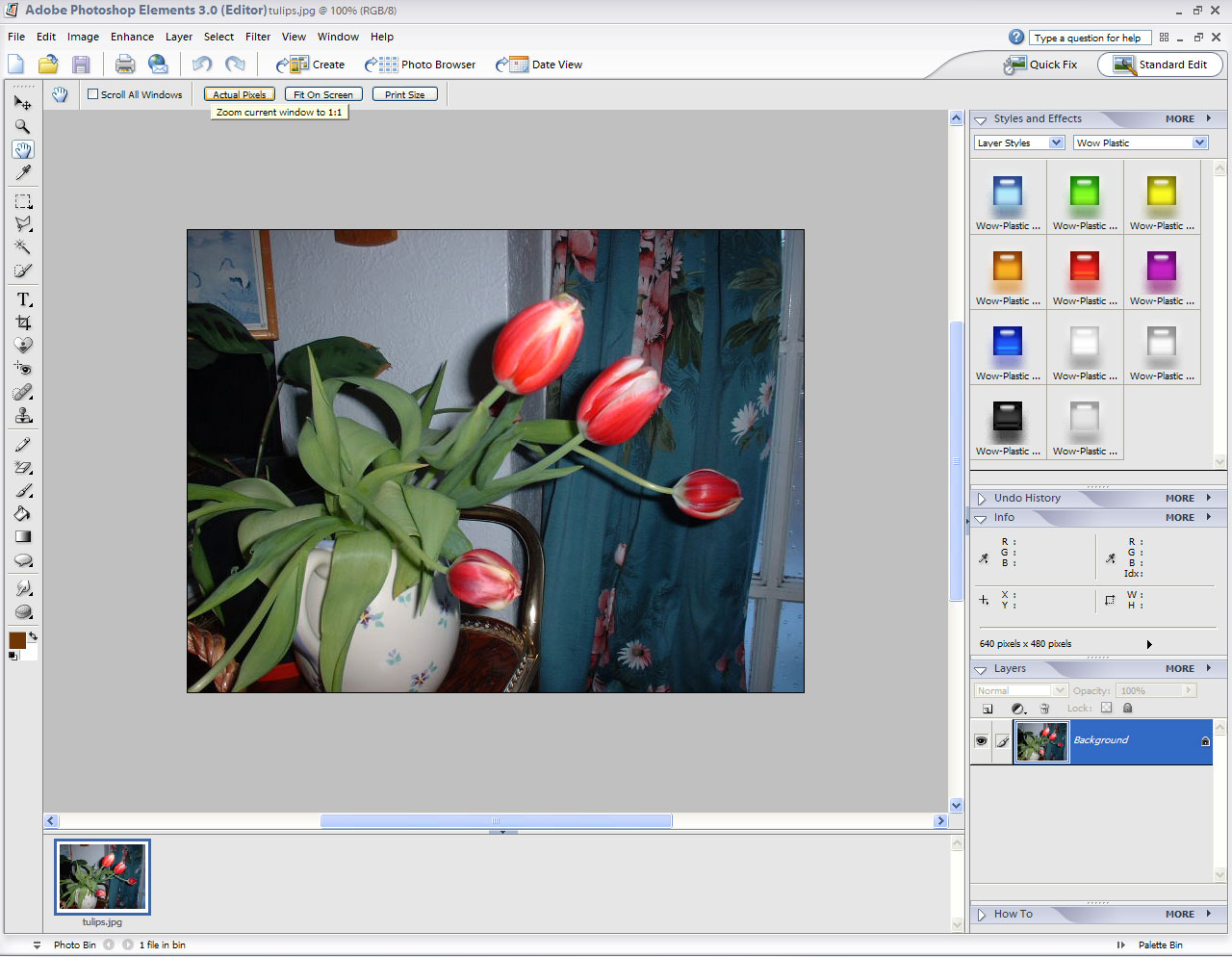
- In PSE1, the whole screen was the workspace. Opening an image meant it resided in all the space available - toolbars were floated at the sides. But now the image space is much reduced, to a fraction of what it was before. Luckily you can get some space back by collapsing a new preview bar (which is quite tall) at the bottom, along with the new fixed pallete bin on the right. The left toolbar of icons now stretches the entire height of the screen, though it is an improvement in that the icons only take up one row. The evil part is that now the image space gives you space-wasting scrollbars on the bottom and the left, even when working with small images. (In practice this works well for large images, only I prefered the much larger image space in PSE1, which only gave a scrollbar if the image was too wide.)
- Every time you save a .PSD file in PSE3 there's an annoying dialogue box that asks if you want to maximise compatibility with other versions of the file format. I've seen an option to turn this off in the preferences, but it would have been better to give a tick-box to never see the dialogue box again. This is standard practice for repetitive dialogue boxes in other programs, including Windows.
- Every time you boot up the program for the first few times, a registration box pops up with two choices - either register online or put it off until later. This offers no option to register by post. (Strange, when there is a registration card in the box.) In PSE1, there was a third option to mail or fax a printed form instead. Assumedly, Adobe now think everyone has an internet connection. Worse, when you try to register, you have to set up an account! No, I'm sorry. Registration should always be optional. These pop-up boxes sure are annoying, guys!
- Agh! The horror! I plugged in a USB pocket flash drive one day. This fired up Adobe Photo Downloader, which comes with PSE3. It promptly started downloading and processing every image on the flash drive! I stopped it after about 900 images had been processed - the total number shown was 2,804 images! Complete madness! Of course I realised the program thought I had connected a digital camera. I soon rooted out the option in the preferences to ensure this never happened again.
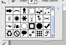
- Sometimes the program gets confused. I've seen tooltips appear underneath a drop-down list of icons, so you couldn't read them. Yet other times they appear on top. (Screenshot)
- I hate the way images often causes the screen to flash and be redrawn. (Opening the program is bad enough - watch those toolbars rearrange themselves in a flurried haste.) For instance, open two images. These will both appear as thumbnails in the bottom bar. But clicking from one thumbnail to another causes the full-size image in the centre of the screen to flash on and off. First, you see the transparent background appear. Then the image is cleared to white. Then the new image appears. I'd hate to work with this program for a long period of time. All the flashing must get to your eyes. The thing is, PSE1 never did any of this.
- I noticed the program uses some files with the extension '.psp'. Those are usually reserved for use by PSP, PSE's rival. So if you had already installed PSP, it could mean you were no longer able to open its files! Deliberate?
- Dates shown in the Organizer (where you can browse images) are shown in the American format. I could find no way to set them to the UK date format.
- In the Layer Effects palette, changing from List View then back to Thumbnail View leaves the thumbnails smaller than before. They no longer fit the palette. Only a reboot cures this.
- Layers and Styles are now on two separate palettes. Not much use when you need all the space you can get.
- The mouse-wheel no longer zooms in and out (because of the scrollbars used around the image space). Another blow to something I found quite handy before.
- Cropping the edge of an image using the selection tool then centres the image, so you have to scroll back to the edge to see what the result was.
- The minimum resolution is stated as 1024 x 768. For PSP9, you can use 800 x 600. I don't see why PSE3 can't be used at that size either (if they removed the ultra-wide icons first). Plenty of people still have that screen size.
Conclusion
This was once a great program. Now it has been rubbished in the name of fancy interfaces, with the result of flashing graphics, a slower work speed and other annoyances that get in the way. I don't want your endless pop-up boxes, thank you. Sure, there are some great new features - a few extra icons (the Healing brush for example), but sadly everything is spoilt by the new interface. I consider this not an upgrade, but a downgrade. I will continue to use PSE1. I can work much faster and flicker-free in that version.
Screenshots
| Description | Photoshop Elements 1 | Photoshop Elements 3 |
|---|---|---|
| Default workspace | JPG 1280 x 994 (159Kb) | JPG 1280 x 944 (197Kb) |
| Intro screen | PNG 495 x 390 (29Kb) | JPG 680 x 538 (57Kb) |
| Menu Comparisons | ||
| File menus | PNG 460 x 526 (14Kb) | |
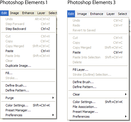
| Edit menus | PNG 456 x 424 (12Kb) | |
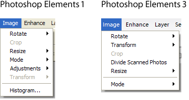
| Image menus | PNG 370 x 196 (6Kb) | |
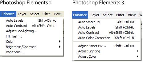
| Enhance menus | PNG 464 x 200 (7Kb) | |
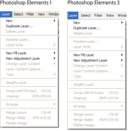
| Layer menus | PNG 410 x 417 (11Kb) | |
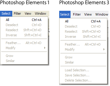
| Select menus | PNG 368 x 287 (7Kb) | |
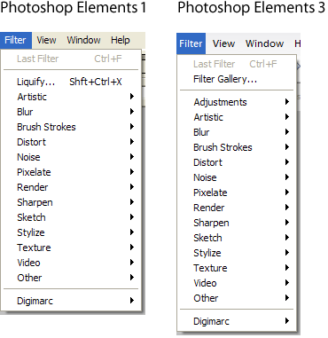
| Filter menus | PNG 370 x 381 (9Kb) | |
| View menus | PNG 396 x 300 (8Kb) | |
| Window menus | PNG 424 x 496 (13Kb) | |
| Help menus | PNG 446 x 257 (7Kb) | |