Minimum Design
14th December 2003 · Last updated: 5th October 2016
While waiting for the bus recently, I noticed a car go by with yellow headlights. I realised that people like to make their own choice - what kind of car to drive, what paint colour to have, what style of interior, even what colour headlights. So there was no way you could make a car that would suit everybody. Early last century, the German design group Bauhaus created a building with identical flats in it, so everyone would share the same living space. But they found that each occupant made their flat unique. Each person wanted to stamp their own individuality on their space.
When it comes to designing web pages, it struck me that we should not be trying to follow the lead of the Bauhaus. There is no way to design a page that will look the same for everyone. People use a wide range of different computers, operating systems, browsers, screen sizes, brightness and colour settings, in an infinite range of places - inside a darkened room, outside on a kiosk screen, or a mobile phone, and so on. To expect to cater for all of these differences is madness. Then there's also font smoothing.
Font Smoothing
Windows XP comes with two methods to improve fonts that directly affect any standard web page that isn't built with Flash. The first is a method whereby large text (and sometimes small too) gets 'anti-aliasing' applied. This adds fading pixels around the letters to make the edges appear rounder. It's the same trick Photoshop users have relied on for years to get quality-looking text. Turn the effect off and you're left with sharp-edged letters that don't look very pretty. This effect can be applied in Windows 98, but you have to turn it on manually. In XP, it's on by default.
The second approach for smoothing fonts is something wonderful called ClearType. Aimed at TFT monitors, this again adds extra pixels of colour to the edges of fonts, but does it in a clever way, so the eye is fooled into seeing much better text. Suddenly fonts look almost as good as their printed versions. I wonder how many people don't even know about this feature?
You can also apply ClearType on a CRT monitor. If the screen is large enough, it can be quite effective, only it can make the text a bit blurry.
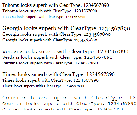
Here are some screenshots showing how much difference font smoothing can make to text. In the first example, I've set ClearType on.
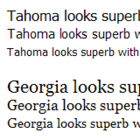
Here we can see what this look like enlarged four times, showing the coloured pixels Windows applies:
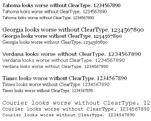
Next, here's what the default Windows XP font smoothing effect looks like. Note how it isn't applied to all the font sizes, resulting in a mixture of smooth and pixellated fonts.
Here's the effect enlarged:
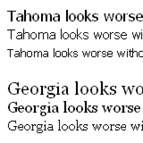
Lastly, this is what fonts look like with no smoothing applied at all. On a high-resolution monitor, it's simply awful. The fonts are pale imitations of their real appearance.
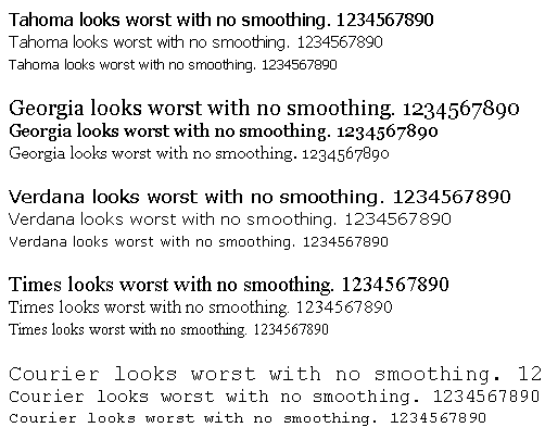
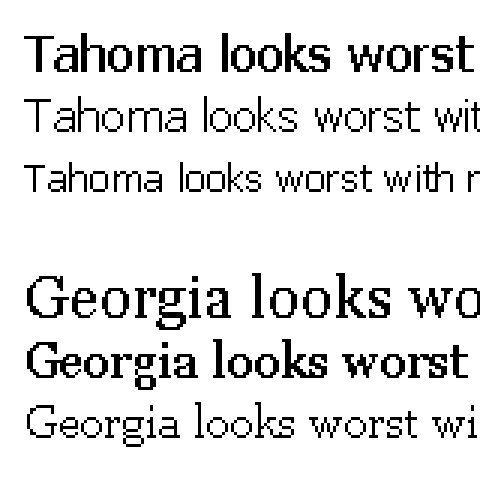
Let's look at those nasty fonts close up. Compare this to the previous examples.
Text Shadow
Users who own the Panther version of Apple's operating system can now experiment with text shadow, using the Safari browser. Text-shadow is a CSS command that adds a shadow to text, funnily enough, resulting in professional lettering that looks like it's an image. So this is another variable affecting the look of text on a web page, assuming the author has coded the CSS to apply it.
Custom Styles
Anyone can also change the CSS used on a web page with the right browser. IE6/Win for instance, allows you to set up a custom stylesheet that is used for all web pages. This might have giant text of a chosen font, perhaps white on a black background. Or you can choose to override the page design so that font faces aren't changed. Imagine that! Your careful choice of fonts destroyed instantly.
Opera 7 comes with a list of built-in stylesheets, showing a page in many unique ways. For example, emulating a text-only browser, where no images at all are shown.
My Point Is
My point is this. With an increasing number of effects the user can apply to a page, how can you control a design anymore? The simple fact is - you can't! For years I lived under the false pretense that I could make a site almost identical in the main browsers. With new browsers coming out all the time, along with new internet devices, the truth is that creating just one design that everyone will see in the same way is impossible. To test on every available platform is also nigh on impossible. Windows users - how does your site look on a Mac? I've relied on Mac users to send me screenshots of my layouts before, only to see them slightly broken.
The best we can achieve is therefore a minimum design. By this I mean something coherent that works for us, but with the use of proper code, will also work more or less for others. We may never know if that's true or not, but we can aim for success by studying HTML and CSS, learning what works and doesn't work for other platforms. The most common trick is to add CSS code that corrects a problem for IE5/Win users to do with the padding of boxes. Although users of IE6 can't see this problem themselves without installing IE5 as well, which has only just become possible, we can still apply the code incase people with IE5 visit our site. I worked with someone recently to perfect a page which was a right mess in IE5. From screenshots I eventually managed to get my code right.
From a design standpoint, we can use 'liquid' layouts - ones where the columns can stretch or shrink to fit the user's screen size. Test your design at different text sizes too. What if the user has their text set to 150% size? Does any of your content become unreadable, hidden from view? What if the user has switched off images? Can they still use your site?
Try font smoothing and ClearType if you can. The latter can make some fonts appear almost bold. What does that do to your design?
Consider also blind users. Does the text on your page make sense to them? Install a free speechreader and try it. Things like acronyms and ALT text on images can change the whole flow of your content - chances are, they'll be read out in full as well as the text.
Printers must also be considered. What does your page look like when printed out? It's a simple enough question, but have you thought about it? Or just assumed it would be OK? Write a print-only stylesheet so you can control the results. You can hide columns that don't make sense when printed out, enlarge text, change the font to something more suitable for printing, remove large graphics that would waste paper if they aren't essential, and much more. Make the text colours dark too. Yellow text won't look good printed out on white paper, if it's even visible at all.
When designing your next layout, try sketching out a rough first on paper. Then make it as simple as you can on the screen. Complex layouts are much harder to maintain, and likely to break in other browsers, especially if they rely on pixel-precise elements. Design flexibly too, allowing for future changes you might make later, like adding another column, or making an existing one wider.
By working on a minimum design we can avoid getting carried away, creating a page that really only works in the current version of your favourite browser. That's likely to be obsolete in a few years anyway. Do you want your pages to be obsolete too?
How To Change Font Smoothing in Windows
Right-click on the desktop and select Properties. Click on the Appearance tab and then the Effects button. Tick the box next to "Use the following method to smooth edges of screen fonts". Make sure 'Standard' is selected on the drop down menu. This is for XP - 98 users might just have the tick box only. Then click the OK button.
To use ClearType in Windows, follow the same procedure above, but select 'ClearType' from the drop-down menu.
Further Reading
Take a look at Bryan Bell's screenshots showing the difference anti-aliasing and text shadow can make to a web page.
Comments (3)
Comments are locked on this topic. Thanks to everyone who posted a comment.
Chris,
Well thought-out article!
I must file a votum separatum though - regarding Clear Type. Although I admit that for some fonts, for some (large) sizes this is advantageous, I can't stand Clear Type applies to most fonts I use (say, Trebuchet MS, and even some you cited), for one particular reason.
ALL TEXT IS BOLD
Yes. Normal font weight with Clear Type is just a little tiny bit "thinner" than a regular bold font weight for fonts without Clear Type. I find it impossible to read text of more than one line with Clear Type turned on. I can't concentrate, because it looks bold to me, and I can;t read bold in large chunks. I can have it only for headings and standalone short text.
Perhaps this is my personal shortcoming, but I swear on the bones of the ghost my grandmother once dreamt about that I have extreme trouble reading Clear Type text. I have it off in my XP.
Fortunately, web authors can't control this setting, and I can choose the setting which I prefer best. It would be hell if I couldn't do that.
regards from snowed-in Chicago,
M.
Posted on 14th December 2003 at 10:31 am 
It depends what screen you're using. If you are on a 17" TFT then ClearType is simply heaven! Yes SOME fonts look like they're bold, but ones like Tahoma and Arial at small sizes are simply beautiful.
To do the screenshots in the article I turned ClearType off and couldn't believe the bitty pixels I was left with. I realise the example image showing ClearType won't work for people with CRTs! It will look fuzzy, but it's a great system because it smooths ALL fonts, unlike XP's default font smoothing which only does certain sizes.
I'm on 1280 x 1024 where the screen is fine enough to make ClearType amazing. I'm not sure it would look so good at lower resolutions, which is perhaps where you're coming from Moose?
Posted on 14th December 2003 at 10:52 pm 
You make some valid points, and although I'm by no means an html/css expert I have always tried to use valid code etc. to make my site visible to the largest audience possible. But it's got to the point now where I really don't care. You don't buy a tv only to find out that it wants to show the pictures in a different way to another tv.
I'm wavering away from your 'minimum design' theory simply because it would make the internet intensely boring. Ok, people using Opera on Windows 3.1 may be able to see it fine but where's the panache? Bring on the microsoft monopoly if it means some kind of standards.
While design/content is an equal partnership, it seems that designers have to spend all their time wondering if a slightly deaf guy in the Ukraine with WebTV will be able to see their site.
I hope I haven't rambled too much. I think I'm going to throw caution to the wind and design a site ignoring everything i've been told about accessibilty. The people who *can* see it will love it
Posted on 15th December 2003 at 12:26 am 